CDE Master’s
Semester Projects, Academic Activities & Erasmus Journey
Internship – Mobility Lab
BIP: Participatory Tools for Urban Nature Planning
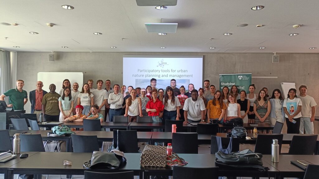
Participation is at the heart of inclusive urban planning, and this Blended Intensive Programme (BIP) brought it to life through a powerful mix of learning and fun. Held in Salzburg from June 30 to July 4, 2025, the BIP brought together students, experts, and institutions from across Europe to explore participatory tools for planning and managing urban nature. From international lectures to hands-on fieldwork, the experience was rich and diverse, ranging from visits to Königsee and Hellbrunn Palace to collaborative group work in Volksgarten, our case study area.
As part of the Blue Team, we developed a participatory strategy for Volksgarten using stakeholder mapping, surveys, social media analysis, and spatial planning tools. The week concluded with team presentations showcasing practical solutions for more inclusive and sustainable urban nature planning. It was a valuable and inspiring experience, rooted in teamwork, learning, and real-world application.
Copernicus Hubs and Institutions – Excursion
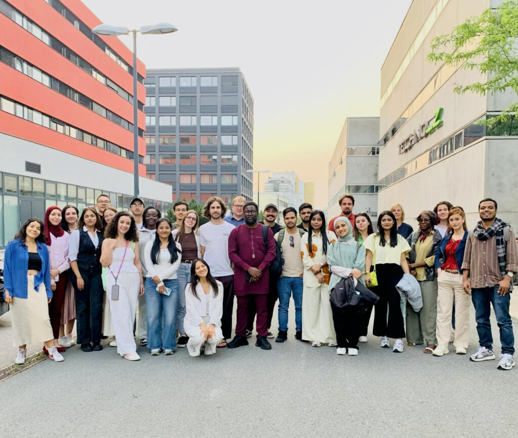
For our excursion for the course Copernicus Hubs and Institutions, we visited the Earth Observation Data Centre (EODC), and the Umweltbundesamt (UBA). This excursion served as a window into Europe’s Space Data ecosystem and its operation in the real world. I now recognize how crucial role these organizations are playing in transforming data into knowledge that can be put to use, not merely keeping it!
I really appreciate the emphasis of EODC on collaboration, scalability and open-source tools through different projects such as GREAT and INTERTWinE. Overall, the visit offered valuable insight into the technical backbone and societal impact of Earth observation, and how Austria contributes to global environmental data efforts.
As geospatial analysts, we understand how important it is to make public geographical data accessible and interoperable, one of the goals of the EU INSPIRE Directive as well and I think these organization are playing a very crucial role in providing a framework for spatial data infrastructure throughout Europe. Not just that these efforts facilitate environmental policymaking, but I, as an urban planner for instance, can readily access, analyse and interpret the data for a variety of purposes! Thanks to these organizations for supporting this ecosystem!
City Exploration App – Geovisualization and Advance Cartography
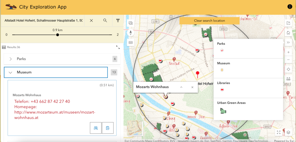
As part of the Advanced Geovisualization & Cartography course in my CDE Master’s, our group created a City Exploration App for 9–12-year-olds. Using data from the Austria Geodatabase, we designed an engaging, kid-friendly interface with a colorful basemap, minimal text, and interactive features like touch and search filters to make city exploration fun and intuitive.
Google Earth Engine
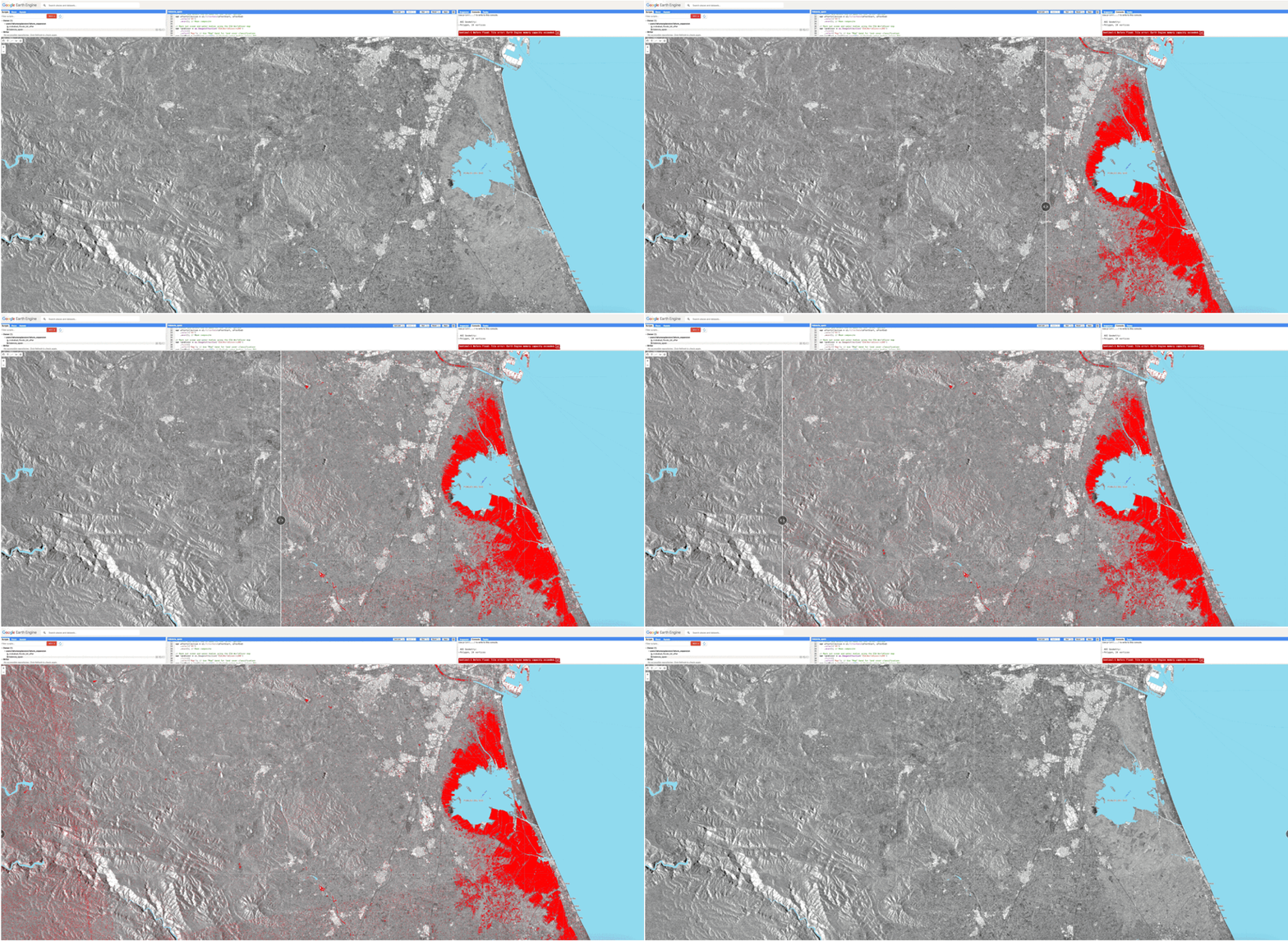
Modifying an existing Google Earth Engine (GEE) script to analyze flood impacts in Valencia, Spain. This involves refining the script to process satellite imagery, extract flood extent, and assess affected areas using advanced geospatial techniques. By integrating time-series analysis and land cover classification, this could enhance flood monitoring accuracy and support better disaster response strategies.
Atlas of the CDE Cohort (24-26)
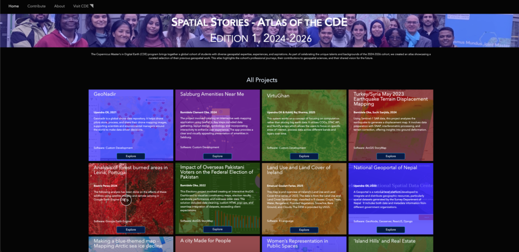
The Spatial Thinking course in Semester 1 of CDE highlighted the power of spatial reasoning, visualization, and communication. Hence, this ATLAS of the CDE was designed to showcase diverse geospatial projects from the 2024–2026 cohort, transforming complex data into insightful, visually compelling narratives across urban planning, environmental management, and GIS.
Analysing Salzburg’s Tourist Attractions Using Spatial Methods
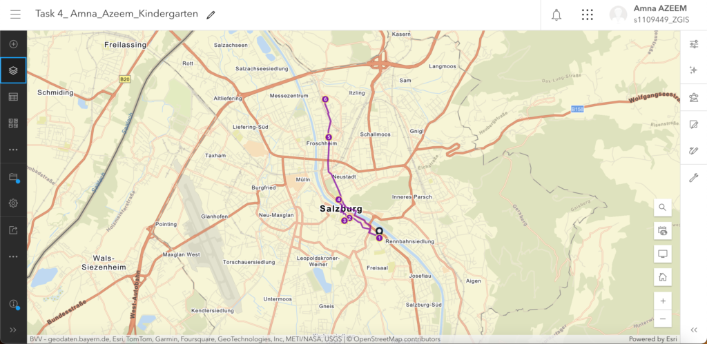
Analyzing Salzburg’s tourist attractions using spatial tools in ArcGIS Online, I explored museums and hotels within 5, 10, 15, and 20 minutes of walking distance from my given address. Using datasets from OSM Tourist Attractions for Europe, a sketch layer for my address, and the Generate Travel Areas tool, I mapped accessible attractions, visualizing proximity and walkability for better urban exploration.
Spatial Analysis of Salzburg’s Terrain
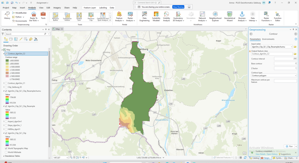
For the spatial analysis of Salzburg’s terrain, I utilized ArcGIS Pro, employing DEM data to generate maps and histograms. The process included catchment area selection, initial analysis, and hillshade creation using raster clipping techniques. By applying Geoprocessing tools, I produced visual representations of elevation and terrain characteristics, enhancing the understanding of Salzburg’s topography.
Leaflet Interactive Map
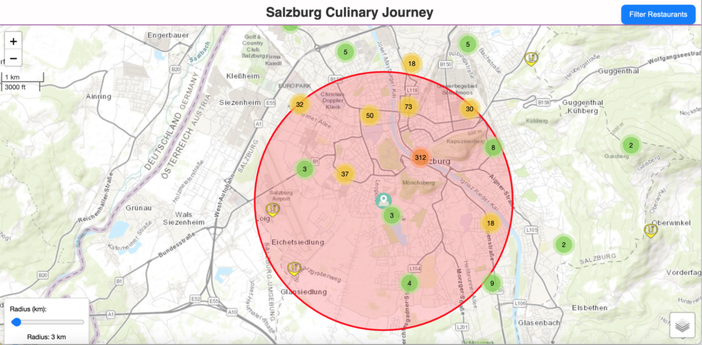
I created a Leaflet interactive map for a Salzburg culinary journey, using OSM restaurant and café data. The map includes interactive features like radius selection, search bar, basemap options, and filters, allowing users to explore the city’s diverse food scene with ease.
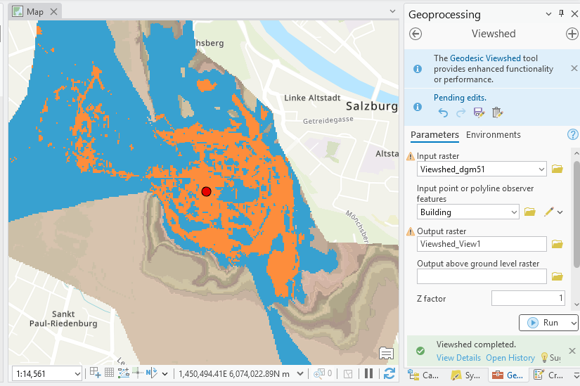
Analysing the Terrain of Salzburg: Viewshed Analysis
The visual impact of planned high-rise construction in Salzburg was evaluated using Viewshed Analysis in ArcGIS Pro. A strategically located point, representing the proposed building, was selected to assess sightlines to key landmarks like Hellbrunn Palace and surrounding green spaces. By generating visibility scenarios, the analysis identifies areas with direct lines of sight, helping understand potential aesthetic disruptions and skyline alterations within the urban fabric.
International Spring School on Visualization
The beginning of April brought with it an enriching experience — I had the opportunity to attend the International Spring School on Visualization, hosted by Palacký University in Olomouc. The theme this year, “Seeing Through Lies: Mapping Trust in the Age of Misinformation,” could not have been more timely. Over two intensive days, we explored the deeper layers of cartography and geovisualization, especially in the context of our increasingly data-driven world. From an urban planning perspective, the sessions sparked important reflections. We unpacked the idea that maps, often perceived as objective tools, are in fact deeply influenced by the choices of their creators — what to include, what to omit, and whose voices are represented. Discussions around the political nature of mapping revealed how spatial data has historically been used to assert control or reinforce inequality, a crucial consideration for planners committed to equity. We also delved into the psychology behind how people interpret maps, including fascinating insights from eye-tracking research — a reminder that how we design visual information can influence understanding, perception, and ultimately, decision-making. In today’s digital age, where misinformation spreads rapidly, the sessions highlighted the ethical responsibility of visual storytellers, including urban planners, to communicate truthfully and build trust through clarity and transparency. The Spring School reinforced that visualization is far more than a technical task — it’s a powerful narrative tool. We must wield it with care, empathy, and a commitment to inclusivity, ensuring the maps we create reflect the realities and needs of all communities.
